
Most disability logos just consist of the usual stick-figure-in-the-wheelchair logo, or a derivation thereof.
After spotting this logo for No Barriers No Borders, I went looking for others. And I got to thinking about the representations of disabled bodies in logos.
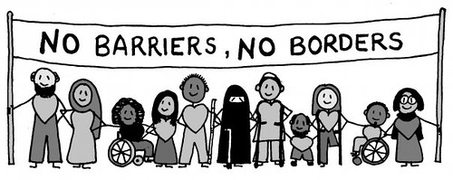
I set aside those images dealing with sport, and those not including any representation of a PWD’s whole body. Here are a few typical samples of what I was left with. I haven’t cherry-picked; I mostly just grabbed from the first few pages of a Google Images search.
My question to you is:
What do all of these logos have in common?
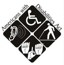
The Americans with Disabilities Act
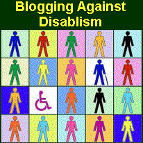
Blogging Against Disablism Day
yapa.com.au “Opening The Doors”
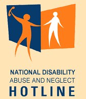
National Disability Abuse and Neglect Hotline
Disabled Rehabilitation and Research Association
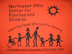
Northwest Ohio Center for Families and Children
Alamonte Springs Advisory Board for the Disabled, Inc
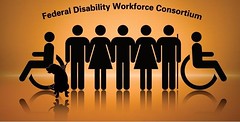
Federal Disability Workforce Consortium
Royal National Institute for the Blind’s Multiple Disability Service

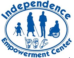
Independence Empowerment Centre
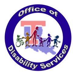
Louisana Tech Office of Disability Services
If you’re wanting an extra clue to where I’m going with the “What do all of these logos have in common?” question, scroll down. For the answer, check out comment 20, or you can click through to the original post at Hoyden About Town to see.
.
.
.
.
.
.
.
.
.
.
.
.
.
.
.
.
.
.
.
.
.
.
.
.
.
.Which group of PWD does every logo exclude?
There may well be other issues to speak about as well as the one I’m picking up on – add your thoughts in comments!
I remember this from HaT, so I’ll hold off posting an answer for now. But I wanted to get the comments counter off zero, so.
Ditto. Take some guesses, folks — there isn’t just one “right” answer; people brought up a fair amount of ideas at HaT and I’m sure y’all could come up with even more.
.-= amandaw´s last blog ..Names =-.
I also saw this at HaT, but I wanted to say thanks for bringing it back. I remember that when I first saw the post I had No idea what could be missing. And while one group of PWD pops into my mind immediately now, I’ll be very interested to see what else other commenters bring up.
.-= mk´s last blog ..Best Spam Ever =-.
Hmm, it’s hard to see…
None of the people, as far as I can see, are fat. Although the Disability Council NSW logo is hard to make out.
.-= PharaohKatt´s last blog ..The Spoon Theory: How Does It Affect You? =-.
PharaohKatt: There might not be any really really big people there, but at least two or three are quite curvy, and would likely be above the arbitrary 30 BMI threshold.
Ok. It’s hard to see, ’cause the logos are small. I’m also browsing on my lappy, which is a netbook (so tiny).
I can’t say whether or not they show mental illness, because it’s a mostly invisible disability. Will keep thinking.
.-= PharaohKatt´s last blog ..The Spoon Theory: How Does It Affect You? =-.
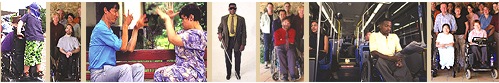
Most of it consists of wheelchairs, walking aids, white canes and the odd guide dog. Only two of them have any reference to deafness or other hearing impairment.
Nothing on amputees, and nothing on mental illness or impairment, or the autistic spectrum.
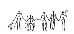
Matthew: I see three references to deafness, and at least one amputee (in the first picture, third from the right). There are also quite a few ‘unmarked’ images, which I’m taking to represent other invisible disabilities – very hard to encapsulate in a logo.
The group I’m thinking of are unambiguously not represented at all.
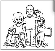
Hmm, I remember the problems we had with this when we were looking for a new cover image for a publication for families with children with disabilities. Out basic chat with the artist went “Most of the families who will read this have kids with autism or ADHD or other invisible disabilities, but how do we represent that?”. We ended up with a big cheery group of adults and children, which included Obligatory Child In Wheelchair, but also people without obvious disabilities. Bluntly, if invisible disabilities were visible, then they wouldn’t be invisible – how the hell do you put that across visually?
Lauredhel: it’s often, though, that wheelchairs are the only symbol used, even when entirely inappropriate. Why do you have to click on the wheelchair to get an audio captcha in Blogger, for example?
I had to cheat. I would not have caught that at all, but once I found out, I was like: “Oh! Of course!” Ableism ahoy!
Marge,
I’ve been trying to do a webcomic about teenagers with disabilities. This is a feat when you cannot draw. It’s also a creative interpretation of “truth” to call it a webcomic, since there are only 2 and I haven’t drawn one for months.
A big reason I haven’t drawn any in months is because the main character has an impairment that I haven’t learned to draw properly. (I can get away with not drawing it, but it’s part of her and not a minor thing).
Her friend has my impairments exactly–and it’s been very hard to figure out how to draw her. They were both necessary for this joke involving a complete stranger reading them as PWD. So I gave her an ankle-foot orthosis like I wore for a little bit as a child, but wasn’t wearing by the time I was her age. (They couldn’t get my AFO to fit right, which is the reason, I think).
.-= Tera´s last blog ..Sweetie =-.
Nobody in a bed or lying down?
Other than that, I do like the first one–I think generic stylized figures are almost white/male by default, so that’s the only one that pings as clearly ethnically diverse/inclusive to me.
Yeah – I had to cheat.
.-= sanabituranima´s last blog ..Getting High =-.
Everybody there is either able to move, in one way or another. There’s nobody represented who is in a bed.
There’s nobody with facial differences. Maybe I’m missing an ambiguous image, but I don’t see anyone using augmentative communication (= alphabet board, talking computer) or anyone using a single-switch interface (blink, puff-n-sip, big toe or other constrained motion control for wheelchair, speech &c).
Matthew @10, unfortunately the ADA design guidelines mandated that the white-on-blue stick figure be used to label “here’s an accessible [– fill in the blank –]” (The ADA also provides symbols for Assitive technology related to Deafness & Blindness.)
Apple Computer’s icon for its system access utility is an improvement, sorta: a gender-neutral stick figure, arms outstretched, centered in a bright blue circle.
Having a standardized symbol for access is a wonderful thing when it’s true.
.-= Jesse the K´s last blog ..PSA: Don’t Tug the Magsafe from your Macbook =-.
Good point – no atypical faces as far as I can see.
.-= sanabituranima´s last blog ..How *dare* they? =-.
@Jesse The K: Ubuntu uses the same icon as Apple in its latest version, for what it’s worth.
Personally, I rather like the icon used for accessibility in Windows Vista and Windows 7 (ironic, as I mainly work on Mac OS and Linux!). It’s in the same general shape as the familiar wheelchair figure, thus making it instantly recognizable, but it actually depicts two diverging paths leading to the same destination.
Apart from a missing leg in one or two picture and what might be a little person, I’m not seeing much in the way of obvious physical atypicality at all. I don’t know how much you could portray via stick figures, but surely more than this?
.-= Kaz´s last blog ..fuck you ubuntu so very much =-.
There is also nobody whose body has proportions that are non-typical. They all are of average hight for their age and their limbs (except for the amputated leg) all have average length.
(are these the correct descriptions? If not, what are better words?)
Mel and The White Lady – spot on, this is what I was noticing.
In the previous post, Sunless Nick was the first to pick up on what I was noticing, which is that none of the bodies are in a bed or otherwise horizontal. All are sitting or standing.
Anna elaborated beautifully:
Logos are, of necessity, shorthand. Nobody expects every single type of body to be present in every single type of logo. However, when you look at a corpus of logos, and one particular type of body is never, ever represented, there’s something going on. These logos show evidence of trying to be inclusive. They depict people in wheelchairs, people standing, people of various sizes and ages, people with crutches and braces and canes, people of multiple genders and races and religions – but the one thing they don’t show is people who have to lie down all the time.
When those people are among the most disadvantaged, the most discriminated against, the most abused, the most isolated, and find it the most difficult to access appropriate, adequate care – and they are ignored by the very organisations claiming to advocate for them – there is a problem.
For more information, check out Four Walls No Limits: Surviving and thriving while confined to bed, homebound, or otherwise stuck in one place.
.-= lauredhel´s last blog ..Public Transport Authority takes crip-blaming to a new level =-.
One of the things I noticed (and I seriously doubt it’s the only answer), is that even among the people in wheelchairs, they are all sitting upright in their chairs (nobody’s using tilt or recline, nobody has to elevate their legs), and none of them have the unusual postures that often come with the sort of body that ends up in a chair. Nobody has a head that pulls to the side or pushes forward, unusual spinal curvature, unusual proportions, obvious physical weakness, or particularly unusual body postures in general. Nobody’s lying flat. They all look like the sort of gimp who can pass for a non-disabled person who just happens to be sitting.
It’s hard to say whether they represent people with psych or developmental conditions, or “invisible” (see other posts for problems with that word) illnesses, because many of those could easily be the stick figures that “look normal”.
.-= Amanda´s last blog ..Blueberries =-.
Amanda: Good point!
I’ve been trying to figure out what’s going on in the Alamonte Springs logo, on the far right. Is that an ear-trumpet?